Aesthetic Images Redesign
Objective
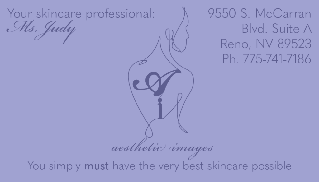
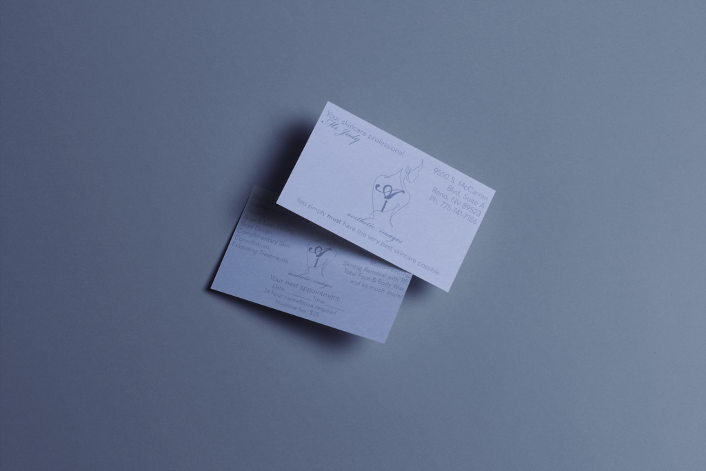
Redesign Logo and Business Card to reflect the company and clientele they have as well as modernizing the look of the company overall. Use sans-serif fonts and purples to reflect the serenity and peace that should come when seeing a professional esthetician.
Solution
My first few logos were not working well, I went for a lettermark using the A and I from the company name as the main idea for the logo, I didn’t find any of these concepts worked well or conveyed what I wanted them too. I did more research, looking into other logos for estheticians and massage therapists, I came onto a linework of a body and knew that was the answer I needed. I used the letters A and I as I first intended but I included them in the linework of the body, reflecting the connection between this company and the body. I chose a purple as the main color and used a screen tint for the background of the business card. I chose purple because it reflects peace and luxury, which should be feelings you have while at an esthetician.
