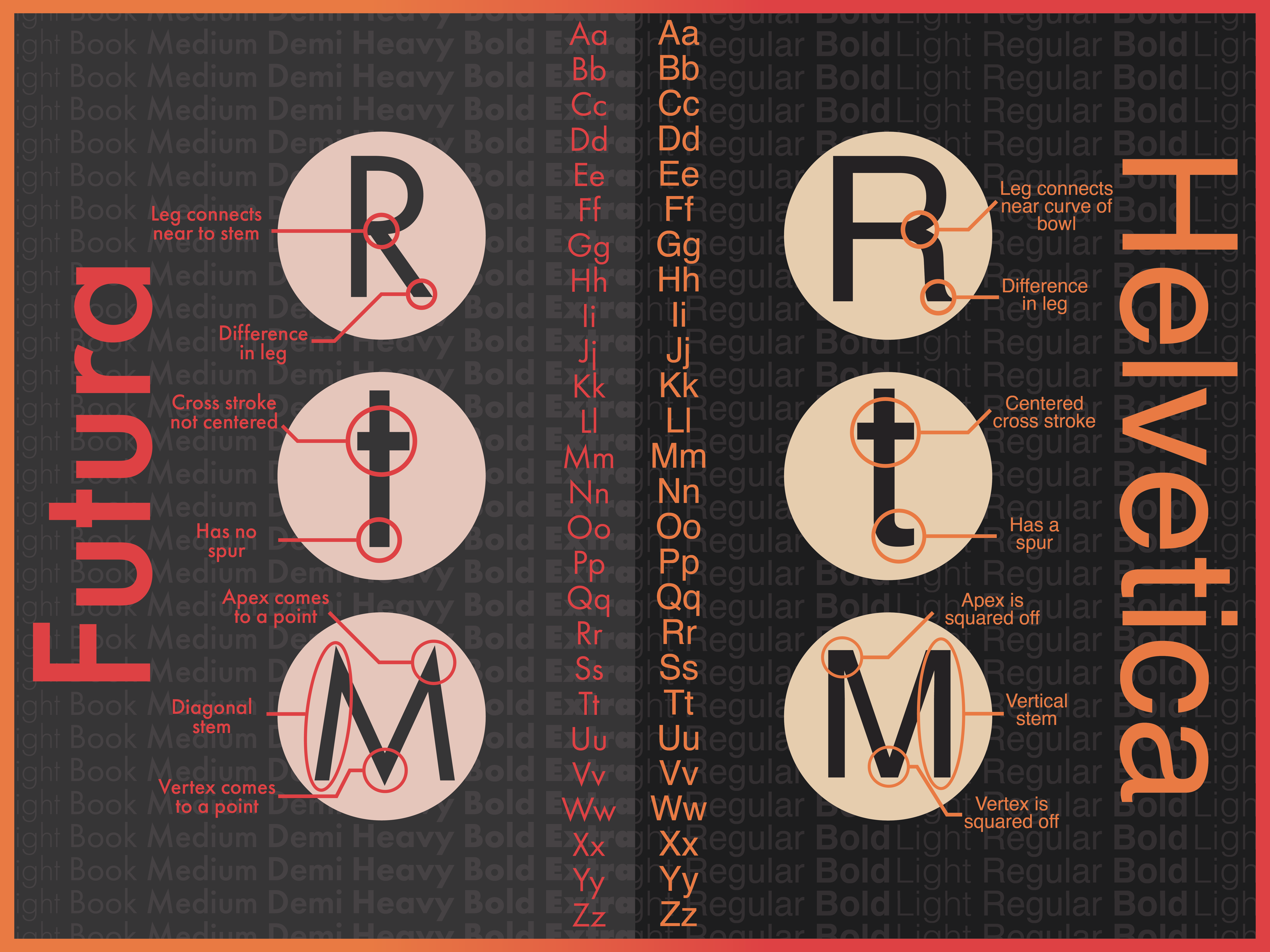
Font Comparison Poster
Objective
Take two similar looking fonts and show off their differences, displaying it in a poster or other medium to create a eye catching design that explains how these fonts differ from one another, the fonts can either be both serif or sans-serif.
Solution
The fonts that I chose to do for this project are Futura and Helvetica, they are very similar and well known fonts that have a lot a of similarities as well as differences. I first highlighted the most different letters between the two and chose the capital R, lowercase t and capital M. These three letters had the most differences. I wanted the poster to reflect the fonts and I chose both colors that usually go along with those fonts.